Showing posts with label Artwork. Show all posts

Monday, February 21, 2011

Bellevue Art Museum & Art Zone

Bound.2
I'm very excited to be a part of The Mysterious Contents of Softness.  Eleven national and international artists are in the show.  It's Organized by Bellevue Arts Museum, curated by Stefano Catalani and made possible by 4Culture and City of Bellevue Arts Program. 


The Mysterious Contents of Softness
February 4  June 26, 2011
Bellevue Art Museum
510 Bellevue Way NE
Bellevue, WA 98004

Members' Reception: Thursday, February 24 • 6 - 9 pm
Free First Friday Lecture featuring Diem Chau: Friday, March 4 • 6:30 - 7:30 pm

Artists Include:
Lauren DiCioccio I remember the first time I saw her water bottles.  I've not forgotten them since.
Angela Ellsworth  One of my favorite pieces from the show.
Rock Hushka 
Lacey Jane Roberts OMG I loved this work!  You have to see the pink fence.
Jeremy Sanders
And me!

I'm also featured on Art Zone with Nancy Guppy.  You can watch it below, my segment starts at 2:40.  If you have trouble viewing it you can go HERE.


I want to give a BIG THANK YOU to Stefano Catalani, Valerie Vozza and Nancy Guppy for their support and for thinking of my work.  You guys are the best!

Wednesday, October 13, 2010

Gravity With John Hudak

Gravity Cover Art
I forgot how I became acquainted with John Hudak's work. But I was instantly captivated by his sound compositions.  A few months ago John contacted me and said he was experimenting with sound clips from other artists and reinterpreting them.  I was intrigued an offered a clip from my grandmother's morning chant.  John's composition of the clip is called Gravity and it's a part of his newest release!  John also asked me to design the cover art.  This was a very enlightening process, thanks for including me!
You can listen to samples and download the album here: http://johnhudak.bandcamp.com/album/gravity


"I've eaten more salt than you have of rice" 2002
 You'll hear the chant in it's original form at the beginning of this video.  This short documentary is about a day spent with Ah-ma (grandmother in Cantonese).  I spent every single weekend and summer with her when I was younger.  Everyone else went to camp or hung out with friends.  I had Ah-ma... and I'm glad I did.  We would spend our days watching corny Chinese soap operas and making food.  She talked about her past and I kept her company.  It's been very hard watching her age.  Even at 83 she's a social bird and very active, but her body had definitely slowed down.

John asked me for something that I felt connected with and I immediately thought of this chant.  My grandmother adapted this morning ritual after having survived cancer.  She wanted a way to give thanks for the day.  I made this during college and this was a learning piece... I have to apologize for the shaky camera work!

There's a Chinese saying, "I've eaten more salt than you have of rice".  My grandmother said that to me so many times.  Basically it infers her age, wisdom and experience.  Because rice is the foundation of most meals you eat a huge sum of it... while only a little bit of salt is eaten.  Therefore if someone has eaten more salt than you have of rice, they've been around a great deal longer than you have.

The Start
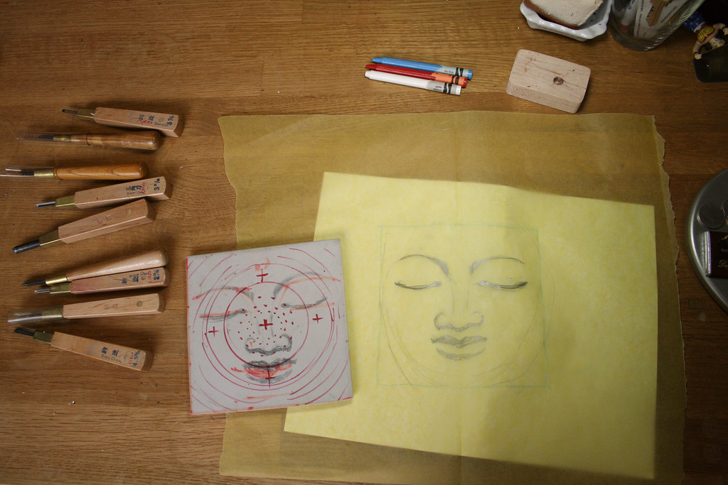
The cover art is inspired by the faces of Buddha statues.  I wanted a meditative image.  I started with a sketch on velum then I transferred the drawing onto a piece of Soft-Kut.  Soft-Kut is like silly putty, just press it against any graphite drawing and the image will transfer.  Then I started carving in a spiral motion to create a radiating effect.

Ridges
You can see the carved marks here.

Print tests
Some test prints.

Tuesday, June 8, 2010

World Cup 2010!

Ronaldo World Cup 2010
I was commissioned by Wieden + Kennedy to carve 66 crayons for Nike's promotion of World Cup 2010!  Eleven special recipients received these boxes... I have no idea who got them, but I'm so jealous!  W+K is amazing to work with and the project was a welcomed challenge!  I had 18 days to make around 70 crayons, there was a week I slept 3 hours a night.  Enthusiasm and great communication from the team at W+K really helped my progress.  BIG THANKS TO:
Kelly Wright
Matt Blum (& Wendy)
Krystle Mortimore
Brad Simon
and the WHOLE TEAM!
Also a big thanks to John Jay for having my work in your office!

Clamshell Open

Clamshell Open
The clam-shell presentation box.


Clamshell Closeup
The contents: the wooden carrier also serves as the crayon's base.

Base Standing
The crayons in their base.

All Pieces
All of the pieces:
The design team at Wieden Kennedy made the box, base and contents.  I made the crayons.  They also chose the colors, it was a metallic/stone theme.  I've never worked with metallics or white before.  I'm a BIG fan of the silver and white crayons now. 
Photos courtesy of Wieden + Kennedy

Fronts
The 6 figures that are in each box.  In the final version Robinho (far left in Silver) sticks his tongue out slightly and Rooney (Grey) has his arm folded instead of raised above his head.  I wish I could have captured Rooney's signature pose, but it was impossible considering the form of a crayon.

Cannavaro World Cup 2010
Fabio Cannavaro in Antique Brass from Crayola.  This color was introduced in 1998 in the 120 box set.

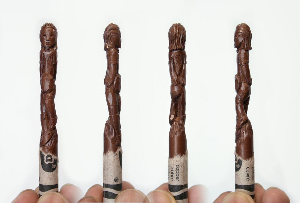
Drogba World Cup 2010
Didier Drogba in Copper from Crayola. This color was introduced in 1957 and is Charles Schulz's favorite color from Crayola.

Ribery World Cup 2010
Franck Ribery in Gold from Crayola.  The color was introduced in 1949 in the 48 box set.

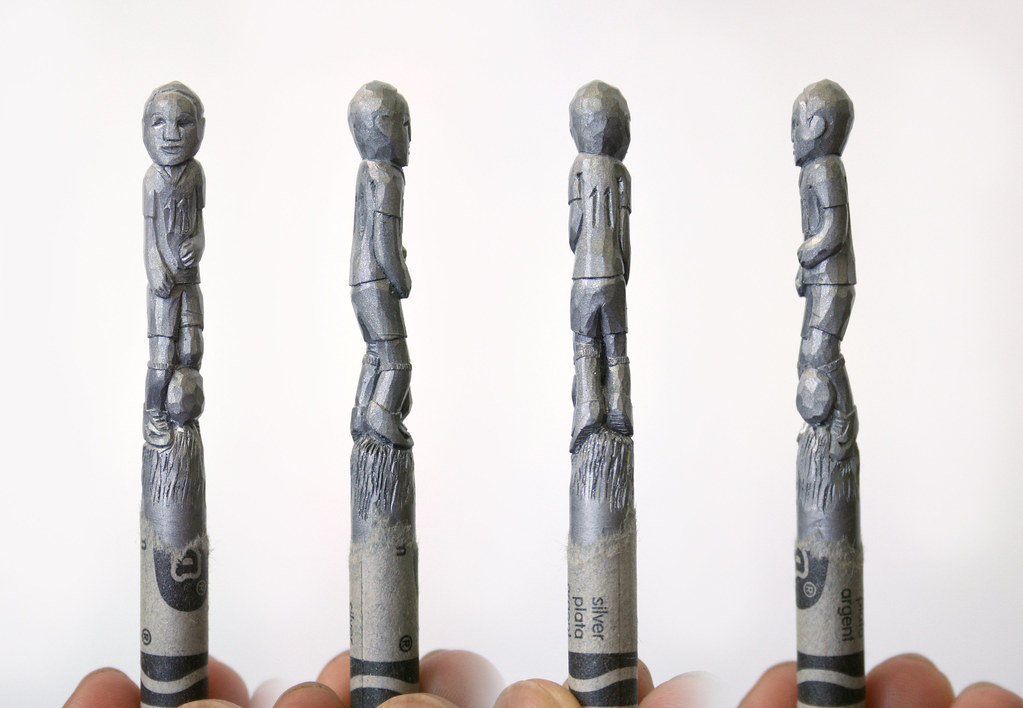
Robinho World Cup 2010
Robinho in Silver from Crayola.  This color was introduced with Gold in 1949 in the 48 box set.

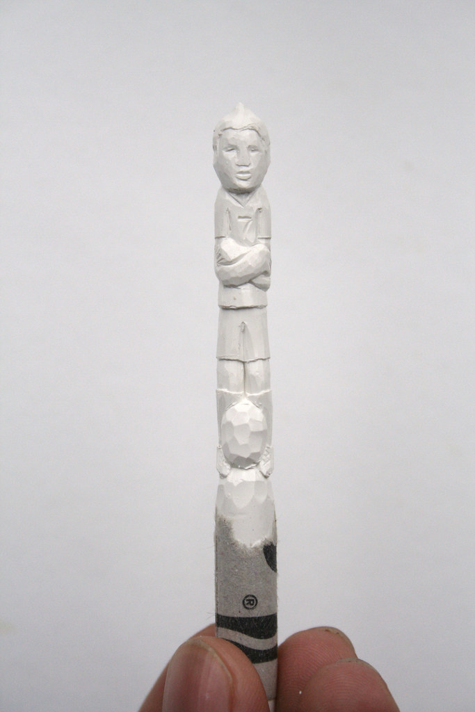
Ronaldo World Cup 2010
Cristiano Ronaldo in White from Crayola. Introduced in the Studio & School 12 box in 1903

Rooney World Cup 2010
Wanye Rooney in Timberwolf from Crayola.  Introduced in 1993 in the Big Box of 96.

Here is Nike's Write the Future World Cup spot.  I love the part where they start printing "Wayne" name bracelets!

http://www.youtube.com/user/nikefootball

Tuesday, October 6, 2009

Double Parlour Collaboration

Close up
I did a collaboration (more of a commission... they did most of the work!) with Ernie and Cassandra Velasco of Double Parlour. They are a husband/wife artist team in SF. Their work is beautiful and quite affordable! I saw their sculptures on Etsy a few months ago and contacted them about a trade/collaboration.


Gia
I drew a little sketch and made two trees.  They sculpted two figures, I got one and they kept one.  You can find more of their work on Flickr or Etsy.

Tree from my head
When I was little my mom told me if I swallowed any seeds it would grow in my stomach and pop out my head. I was scared to eat anything with seeds in it! Thanks mom >_< 

Wednesday, June 10, 2009

Monkey Business

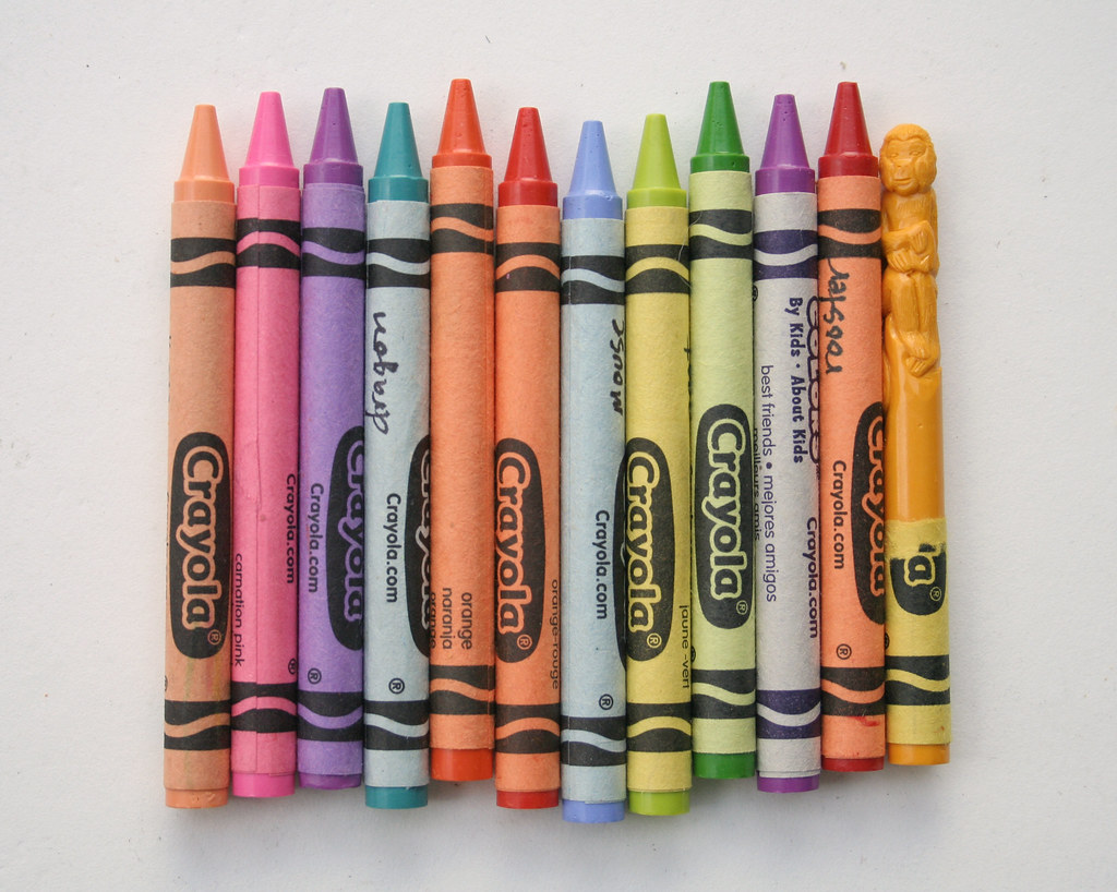
Can you guess?
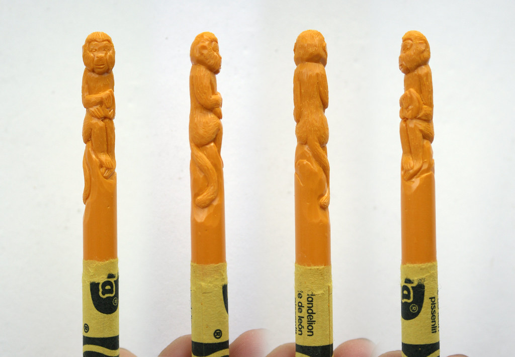
A currently project. I've always wanted to make a set of Chinese Zodiac figures. With this series I'm trying to push for more detail, make them cleaner and tighter.

Monkey
The Monkey

Wednesday, April 29, 2009

Crayons in US Cellular Commercial!!!


I was commissioned by Publicis & Hal Riney to work on a US Cellular commercial. It was a great collaborative experience. I LOVE the result, the shots, the music, everything! I believe the commercial will air this month nationwide. Unfortunately not in Seattle, but you can view it here! This is a 30 sec spot and starts about 10 seconds in... the earlier video I posted has been put on hold for now until it airs. :)

A great big thanks to:
Adam Koppel, Richard North and Debbie Chin of Hal Riney Publicis.

Kevin Berve the wonderful gentleman who did the molds and melting... I'm glad we had a chance to connect. I hope you and your wife get to visit Vietnam one of these days!

**Update**
Some behind the scenes photos
Images of the crayons involved